This post was last updated on 12/26/2018
Depending on what theme or page builder you’re using, Contact Form 7 might end up not being responsive when you add it on your page.
The form might have a fixed width, which will result in fields getting cut off on mobile devices.
It happened to me on several occasions while working on some projects.
What can be done to fix this issue? I’ll show you in this post!
Make Contact Form 7 full width & responsive
These fixes will work in the majority of cases.
For some, though, it might not work, because it mostly depends on the theme or page builder, and how developers tweak the code.
Scenario 1 – The whole form has a fixed width

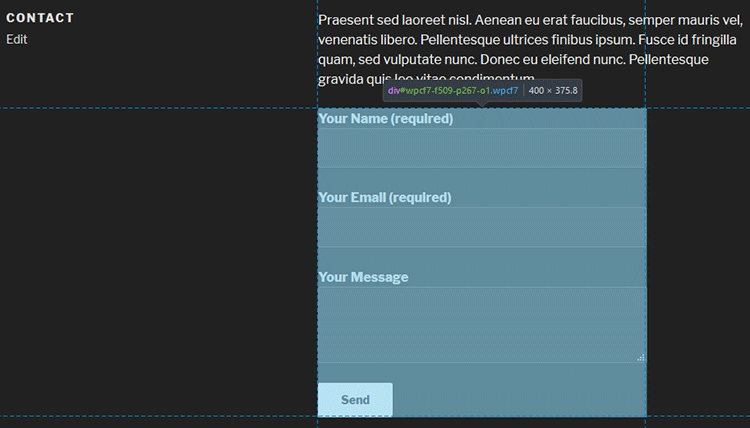
As you can see, the whole form has a fixed width of 400px. It doesn’t stretch all the way in the container like the text does.
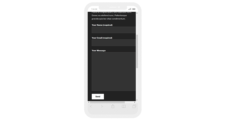
On mobiles, the text will adjust to the screen size, but the form will get cut off, as you can see below.

In order to fix this, we’ll have to set a 100% width to the form by using the following CSS code, which you can simply add by going in your Dashboard -> Appearance -> Customize -> Additional CSS.
.wpcf7 {width:100% !important;}
You can also try the following one, if the first one somehow doesn’t work:
.wpcf7-form {width:100% !important;}
Here are 5 different ways to add CSS in WordPress.
Scenario 2 – The form has a 100% width, but the fields have a fixed width

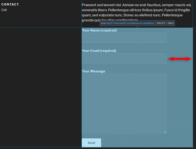
Notice the difference from the first screenshot?
The blue frame is the form itself, the container, but now the fields within don’t stretch the whole form width.
So, we have to make their width to be 100%, and we can do this with another small piece of CSS code:
.wpcf7-form label {width:100% !important;}
Update: I don’t think label works anymore, so use these instead:
.wpcf7-form input[type="text"], input[type="email"], input[type="url"], input[type="password"], input[type="search"], input[type="number"], input[type="tel"], input[type="range"], input[type="date"], input[type="month"], input[type="week"], input[type="time"], input[type="datetime"], input[type="datetime-local"], input[type="color"], select, textarea {width:100% !important;}
I’ve added all the input types that you might use. You should remove the ones that you don’t use.
For example, if you only use Name, Subject, Email, and Message fields, then your code should look like this:
.wpcf7-form input[type="text"], input[type="email"], textarea {width:100% !important;}
!important is not necessary in most cases, so see if it works without it first.
That’s it!
One of these two fixes, or even both, will make Contact Form 7 responsive, at least for most people.
Like I mentioned above, it depends on the theme and page builders as well.
That’s a wrap
Hope you found the post comprehensive, and it fixed your Contact Form 7 responsiveness issue.
If you have any questions or thoughts, drop a comment, contact us or message us on Facebook.
You can also follow us on Twitter and subscribe to our YouTube channel.
If you want to start your own WordPress blog, or need a website for your business, our WordPress services are at your disposal! We also provide WordPress support and maintenance!
You can also purchase a ready-made WordPress website with hosting and support included!


Thanks, i just loved your article.. theses are so helpful and comprehensive..
Thank you! I appreciate it!
Sorry for the late reply :(
worked the first time, but when i tried again those fixes didnt have any effect.
I checked it out a bit and I think that some things have changed with the recent updates.
Add
inputinstead oflabel, like this:.wpcf7-form input {width:100% !important;}.The code for the whole form (scenario 1) should still work.
I’ll update the post as well.
Thanks for letting me know!
i tried this using “input” and it is working except that the message box (the biggest box) is still fixed size and not responsive, The “Send” button on the other hand, is the one stretching and it stretched screen-wide. “Your name” “Your email” and “Subject” text boxes are working perfectly
Thanks for pointing this out! You’re right, it’s my bad.
inputworks for allinputtypes, includinginput[type="submit"], which is the button. And the message box doesn’t useinput, it usestextarea, that’s why it didn’t change.So, you’ll want to use this:
.wpcf7-form input[type="text"], input[type="email"], textarea {width:100% !important;}This will make the text, email, and message fields responsive, without the button.
I’ve also updated the post with more input types that you and others might use.
Let me know if it works now.
hi these tutorials are great but the one thing i cant get to work is to make the text within the submit button responsive? the button its self is responsive but the text bleeds out the right hand side when reduced small.
i do have a long amount of text ‘GET YOUR FREE INVESTMENT GUIDE’ but i assumed it would just line break onto two lines when small?
what am i missing?
many thanks
Hello!
I hate it when that happens.
Add this CSS code:
.wpcf7-form input[type="submit"]{white-space:normal;}It works on my end, I tested it.
Add
!importantif it doesn’t work:.wpcf7-form input[type="submit"]{white-space:normal !important;}Clear your page and browser cache as well.
Any idea how to make the captcha container responsive? All the other fields behave themselves except that one. When I do tweak the CSS the “refresh” portion of the captcha doesn’t wrap or flow — it just is not viewable.
If you’re referring to the
[quiz]tag, then that’s a text field, so it should work withinput[type="text"], as you see in the post.If you’re talking about reCaptcha, then those JS and CSS files are loaded externally from Google, so there’s not much you can do about it, at least not in this case.
But reCaptcha fits well on mobiles. Are you using a 3rd party tool to add a captcha to Contact Form 7?
I bought a theme that has turned out of be nightmare code.I’m trying to get the reCaptcha to play nice with within a sidebar and the sidebar is only displayed on post pages and category post pages.
I am using Contact 7 Form Mailchimp Extension.
I see. Well, you have a different situation here. First, you’re using the Contact 7 Form MailChimp Extension. Second, you’re using the form in a sidebar. Third, reCaptchca has a fixed width of 300px, so it won’t behave well on smaller sidebars. And last, you’re saying that the theme doesn’t help either.
So, there are several different factors you have to deal with. Try asking for help on CF7 MailChimp Extension’s forum. Maybe they’ll have a quick solution.
I noticed that you aren’t including the [select]. Adding simply, select will include the select container containing the select’s options.
Thanks for pointing it out! I added
selectnow and a few others.That’s nice, however you should try the Smart Grid Layout extension plugin for Contact Form 7. It allows for multi-column form designs using a UI editor and produces a fully responsive (pure css) form layout. (https://wordpress.org/plugins/cf7-grid-layout/)
If someone wants to create a more complex form on multiple columns, then yes. Otherwise, it’s not worth installing another plugin just to make several fields responsive.
Actually in this case your mistaken. The smart grid also fixes many shortcomings of cf7 such as targeted CSS/is resource loading. CF7 plugins loads is resources on all the pages regardless of whether or not a form is included on that page. The smart grid fixes this.
UPDATE!!
Label AND Input DO work!
Label is for the text, Input is for the other stuff, THIS CODE WORKEd for ME:
.wpcf7-form label, input {
width:100% !important;
}
Then just put a padding-right: 30px;
and
padding-left: 30px;
then it should work!
Your code is good as well, to make all the input fields 100% width, not one by one.
Note that
textareaandselectare not inputs, so you have to add those as well.Hello! None of these work with my theme :( I have OnePress theme and built everything with Elementor Plugin. Do you know how can I fix the responsive view?
Thanks!
Hello! Did you add the Contact Form 7 shortcode in an Elementor widget? If so, which one did you use? You can also give me the link to the page and I’ll take a look.
Thanks for this! Setting the width to 100% does work for me using Mobile. But when I check Desktop I would really only want to have about 30% width. Any suggestions?
Thanks so much.
Great Help . Fixed in one go. Thanks.
The tag before input field is preventing to change size. Cannot even remove p tag by adding lines to wp-config and functions.php.
I am using Elementor page builder and contact us 7 form
Wow Thank you ThemeSkills,
Your article and your coding helped me solved my problem
Thankyou very much for your timely help
Nice, one of them worked!