UPDATE: While the new table block from Gutenberg is responsive-ish, it will still look bad if you have a lot of columns. Unfortunately, the below code won’t work with Gutenberg, but it will work in case you’re using the Classic Editor plugin.
If you don’t use a specific plugin for WordPress tables, and you simply create an HTML one in your Text editor, or you use the TinyMCE Advanced table feature, which I think that many of you do, then the table won’t be responsive by default.
In this post, I’ll show you how to make your table responsive in WordPress, without using yet another plugin! We’ll just get our hands dirty by adding a little bit of CSS, just a little.
I’m going to use the easiest method, so all of you can implement it without any hassle.
The table won’t be responsive in a traditional kind of way, because it will look pretty bad with all the columns squeezed together vertically. Instead, we’ll add horizontal scrolling to it!
Make a table responsive in WordPress
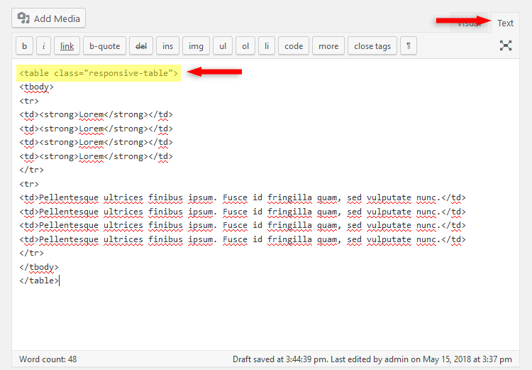
1. After you’ve created your WordPress table, you’ll have to add a CSS class to the <table> tag, like, responsive-table, resulting in <table class="responsive-table">.
In order to add the CSS class, you’ll have to use the Text editor, not the Visual one!
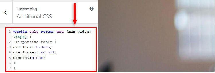
2. Now, after adding the class, add the following CSS code in Appearance – > Customize -> Additional CSS:
@media only screen and (max-width: 768px) {

.responsive-table {

overflow: hidden;

overflow-x: scroll;

display:block;

}

}
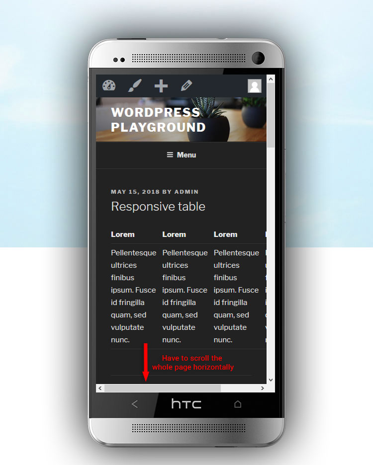
Now, just the WordPress table itself can be scrolled horizontally, not the whole page, so it won’t break the layout and design, like it would happen if the WordPress table wouldn’t be responsive – see top image.
The way it will display on mobile devices can differ. On some, a horizontal bar will appear, on others, it won’t, but the table will still be horizontally scrollable.
The best way to see this is to check it on your smartphone, and not use a mobile emulator.
class inside the <table> tag (step 1), that’s it! You won’t have to add the CSS code again (step 2)!That’s a wrap
Hope you liked the post and found it comprehensive enough, in order to make your WordPress table responsive, without using any plugin!
If you have any questions or thoughts, drop a comment, contact us or message us on Facebook.
You can also follow us on Twitter and subscribe to our YouTube channel.
If you want to start your own WordPress blog, or need a website for your business, our WordPress services are at your disposal! We also provide WordPress support and maintenance!
You can also purchase a ready-made WordPress website with hosting and support included!

Thank you for sharing.
This is helpful.
I tried it, and it didn’t work. Is there something I am doing wrong? I added the CSS code as well.
Is there anything changed? Or the code doesn’t do anything?
Hey, thank you for this. I was trying to add Amazon product links and to have them be responsive on my Page – turns out your solution works with using a table – I’m thrilled!
1) I added the CSS to the theme
2) I added the responsive class to the text of the page
3) I simply copied and pasted the affiliate links from Amazon
4) Totally works!
*without a table
That’s great! I’m happy to see that the post helped you out!
Awesome. It worked. This simply makes the table scrollable on mobile devices which does the job for me.
Thanks
Great! I’m happy to see that it worked for you!
Thanks it work on my site
This is make visitor more easy to view the table
I’m glad it worked for you!
Hi, it works great for me too. However, i’ve images included on the table and they shrink to a point where you can’t recognise them on mobile. Is there a way to alter this? The table works great and can scroll across, it’s just the images that have shrunk.
Hello! I’m glad it works!
As for the images – that’s how responsiveness works. If you’ll give them or the table cell a fixed width, it will ruin the responsiveness of the table.
You could link to the image file, and when the readers click on the image inside the table, it will get enlarged. If you could use a lightbox feature for this, it would be even better.
Hello! Thank you for this CSS code, it was a great help for my tables on mobile view. I just have the problem that the code removes all borders in the table. This makes my table look rather messy, is there any chance you can help me get those borders back? :-)
BR
Lise
Hello! That shouldn’t suppose to happen. All the borders disappeared? It’s hard to find the issue without having a look, but it sounds like there could be a conflict with your theme’s code.
Thank you for such a quick reply!
Probably a conflict with my theme then yes.
Bad luck, that’s beyond my skills :-)
If they offer support, you could contact them. It can also be one of your plugins to blame.
Thanks fore the code! It helped a lot. Could you please tell how to set minimum with for a table? For example: i want the table to be minimum 700px wide and it must be responsive at the same. I tried to add min-width: 700px; but unfortunately the table becomes unresponsive. Thank you :)
I’m glad the code helped! Responsive design isn’t meant to have fixed widths, that’s why the table stopped being responsive when you added min-width. Try using % instead of px (e.g. 50%). That could break the code, too, though, I haven’t tested it.
Hi ThemeSkills!
This code doesn’t seem to work on Safari (it works on other browsers though) — any way to make this work on Safari?
Thanks!
Hello! I’m sorry, but I don’t know why it doesn’t work, although it should. I can’t test it with Safari since I don’t own a Mac.
Thanks, i have a question please, can you tell me the css of – any table fit on mobile screen without horizontally scrollable. I want when my post open in mobile, my post see on fit screen with table.