The simplest way to add a YouTube video in WordPress is by simply copying and pasting the URL in a page or post, and, if your theme is responsive, the YouTube video will automatically become responsive too and properly scaled down on mobile devices.
Let’s see an example.

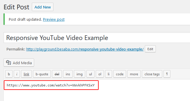
I’ve created a post and simply pasted a YouTube link. Now let’s see if it’s responsive.

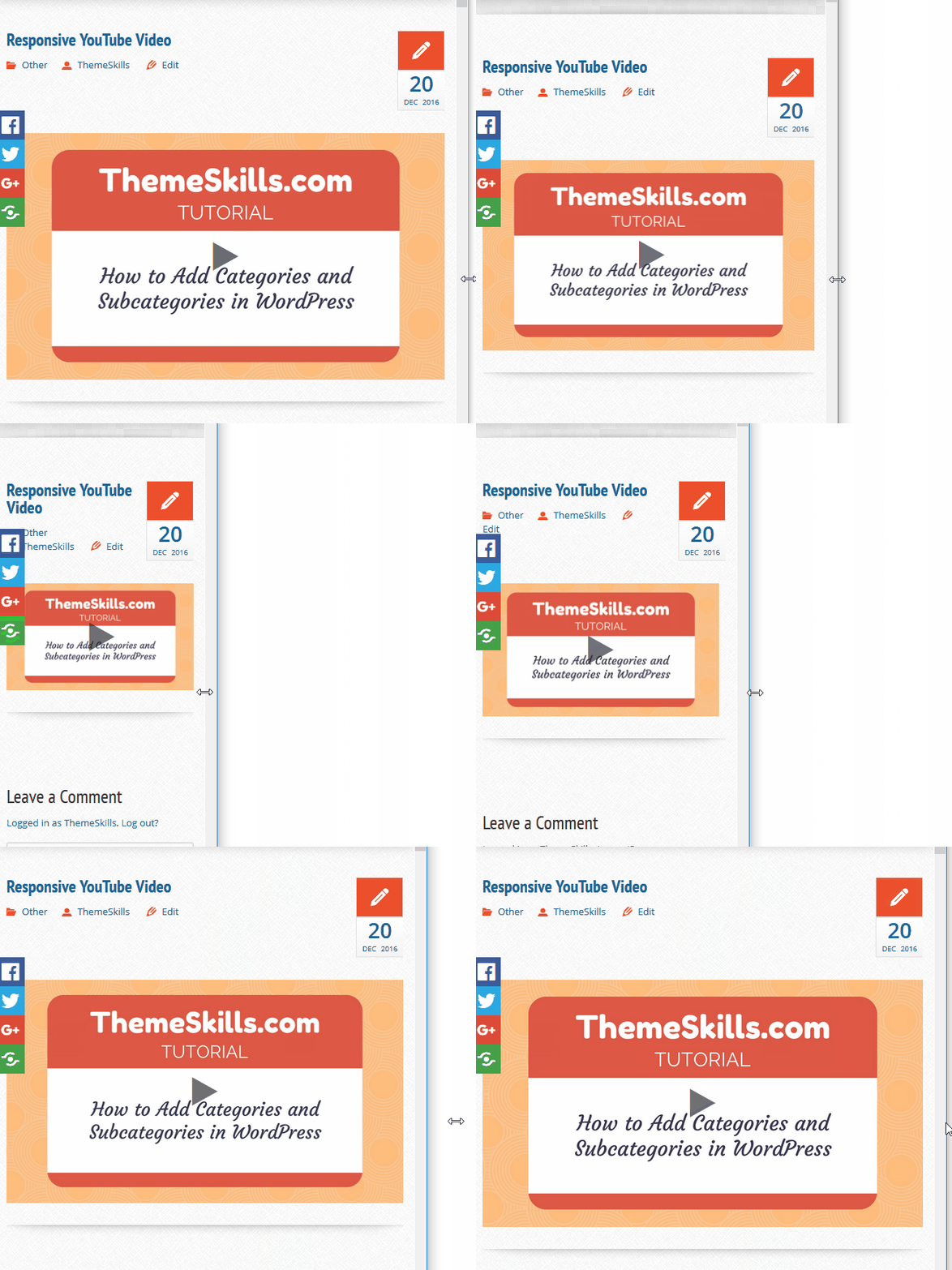
As you can see, as I shrink my browser, all the content, including the YouTube video, gets scaled down, becoming responsive.
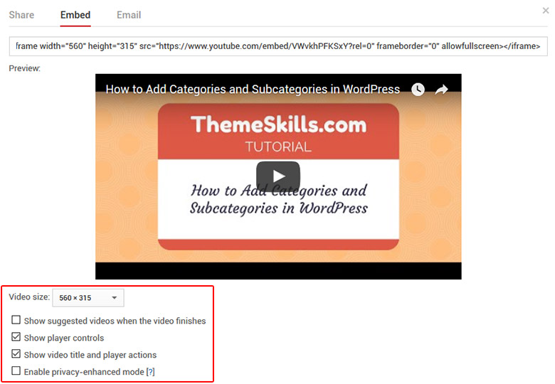
But what if you want to embed a YouTube video using an iframe, thing which allows you to choose between several options, like setting the size of the video, switching player controls on or off, and other such options that you can see below.

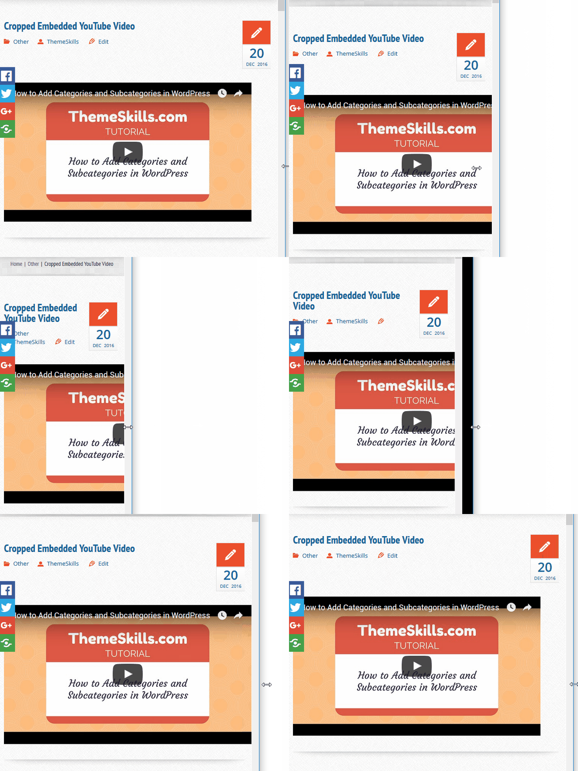
Now, some themes are optimized for displaying responsive iframes, but many aren’t, so your embedded video will not scale down on mobile devices; instead, it will just be cropped off, as you can see below.

Fortunately, there’s an awesome CSS code that you can implement to fix this issue. I think it’s better than to install another plugin that might bloat your website some more. The fewer plugins you have, the better.
How to make an embedded YouTube video responsive
Here’s what you need to do:
1. Go to your desired YouTube video, press “Share’, then click on the “Embed” tab and copy the iframe code. The video options you select will appear in this code.

2. Paste it inside a post and wrap it in a div tag with a “class”.
For example: <div class="youtube-responsive-container"><iframe ...></iframe></div>
3. Now you have to add the below CSS code. Here’s how to add CSS in WordPress.
.youtube-responsive-container {

position:relative;

padding-bottom:56.25%;

padding-top:30px;

height:0;

overflow:hidden;

}
.youtube-responsive-container iframe, .youtube-responsive-container object, .youtube-responsive-container embed {

position:absolute;

top:0;

left:0;

width:100%;

height:100%;

}
4. Save the file.
That’s it! Now your embedded YouTube video should be responsive.
Now every time you add an embed code into a post, make sure to wrap it in the div tag: <div class="youtube-responsive-container"><iframe ...></iframe></div>. You can change the “class” name, though, but make sure you always use the same one.
You don’t have to add the CSS code again, just the div tag around the iframe code.
That’s a wrap
Hope you enjoyed the post and found it useful!
If you have questions or thoughts, please leave a comment, contact us, or message us on Facebook.
Don’t forget to share!


Thank you! Ever since the new WordPress update my website has been on the fritz. Of course it had to happen when it’s important for it look amazing. Your code saved me from looking unprofessional. >>HUGGS<<
You’re most welcome! I’m happy to see that my post solved your issue!
Very Simple. Worked perfectly!
Awesome! I’m glad it worked for you! Thanks for letting me know!
My issue is that while this worked like a charm on mobile it has made all the videos on Desktop huge and left aligned and I can’t figure out why.
Any ideas?
It’s pretty hard to spot the issue without a more in-depth investigation. It could be theme related.
But, since we only want the videos to be responsive for mobiles, wrap the code from the post in this:
@media only screen and (max-width: 767px) {code from the post goes here...
}
This should make the code apply only on tablets and smartphones.
Thanks I’ll try that now!
You Rock – that totally fixed my problem.
That’s great! Thanks for letting me know!
You can also just edit the code so it reads: width=”70%” and this will make it responsive!
It may not do the trick on some themes. Also, making it 70% (or anything other than 100%) will make it look like it’s aligned to the left unless you center it somehow. The height also needs to be set to keep a proper aspect ratio, and setting both width and height to 100% directly in the embed code won’t work properly.
Hello,
I’m having a problem with this fix. I’ve added your code to my custom CSS but what happens is that where my youtube videos are normally centered, they now appear to be aligned to the left of the screen. I’m working on a website in a closed environment that I can’t share, and I’m not sure if it’s something your code does or if it’s a problem with my other custom css code and site tweaks. Is there something in your code that causes it to do this?
Never mind :) Your “@media only screen and (max-width: 767px” bypassed the problem. Thanks alot for the fix!
Awesome! I’m glad that fixed your problem!
Works when I resize the browser but not on an actual iphone.
Have you tried clearing your site and browser cache after adding the code?
i have used this and it works well and exact thing i have been looking for all this while, thanks a lot for this useful article
I’m happy to see that it works for you! Thanks for letting me know.
Thank you! This was an easy solution to copy and pate. I put the div around an [embed] shortcode
I’m glad it worked for you. Thanks for the comment.
Thanks so much! Really easy for a rookie like me to apply.
hello
Thanks for the post, am having a similar issue. Its a video embedded on my website, it doesn’t play and its not responsive on mobile. Actually its a youtube video but hosted on another site. (ovyoo.co), I copied the embedded code and put it in my html page, but it doesnot play on front end, and its not responsive on mobile.
This has been giving me headache for days now, i would really be glad if u can help with any advice as to how to fix this.
this worked perfectly for me, i also shared the post with my friend. Thanks fro this wonderful post
Thanks for your solution, worked effortlessly, kudos to you