
The simplest way to add a YouTube video in WordPress is by simply copying and pasting the URL in a page or post, and, if your theme is responsive, the YouTube video will automatically become responsive too and properly scaled down on mobile devices.
Let’s see an example.
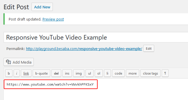
I’ve created a post and simply pasted a YouTube link. Now let’s see if it’s responsive.
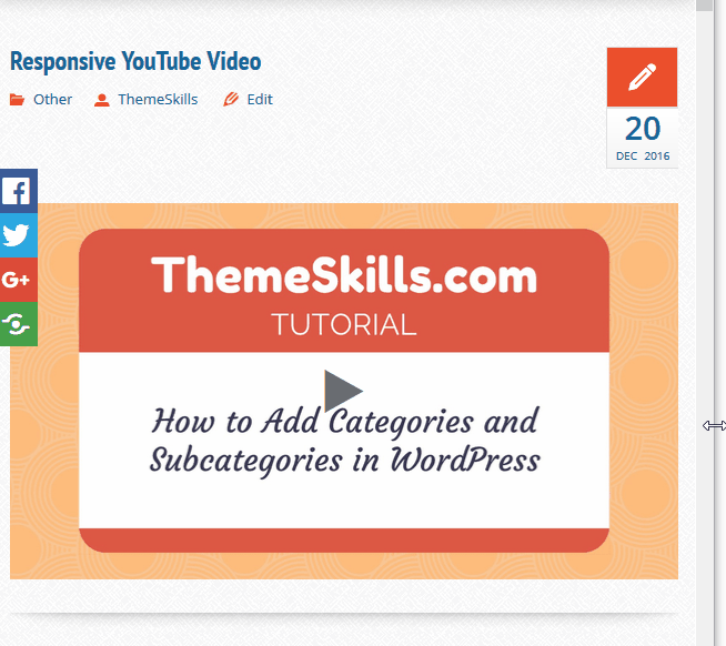
As you can see, as I shrink my browser, all the content, including the YouTube video, gets scaled down, becoming responsive.
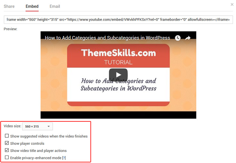
But what if you want to embed a YouTube video using an iframe, thing which allows you to choose between several options, like setting the size of the video, switching player controls on or off, and other such options that you can see below.
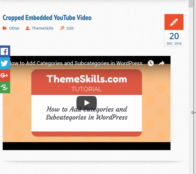
Now, some themes are optimized for displaying responsive iframes, but many aren’t, so your embedded video will not scale down on mobile devices; instead, it will just be cropped off, as you can see below.
Fortunately, there’s an awesome CSS code that you can implement to fix this issue. I think it’s better than to install another plugin that might bloat your website some more. The fewer plugins you have, the better.
How to make an embedded YouTube video responsive
Here’s what you need to do:
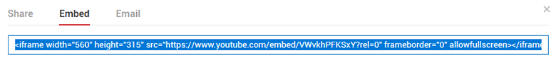
1. Go to your desired YouTube video, press “Share’, then click on the “Embed” tab and copy the iframe code. The video options you select will appear in this code.
2. Paste it inside a post and wrap it in a div tag with a “class”.
For example: <div class="youtube-responsive-container"><iframe ...></iframe></div>

Click to enlarge
3. Now you have to add the below CSS code. Here’s how to add CSS in WordPress.
.youtube-responsive-container {

position:relative;

padding-bottom:56.25%;

padding-top:30px;

height:0;

overflow:hidden;

}
.youtube-responsive-container iframe, .youtube-responsive-container object, .youtube-responsive-container embed {

position:absolute;

top:0;

left:0;

width:100%;

height:100%;

}
4. Save the file.
That’s it! Now your embedded YouTube video should be responsive.
Now every time you add an embed code into a post, make sure to wrap it in the div tag: <div class="youtube-responsive-container"><iframe ...></iframe></div>. You can change the “class” name, though, but make sure you always use the same one.
You don’t have to add the CSS code again, just the div tag around the iframe code.
That’s a wrap
Hope you enjoyed the post and found it useful!
If you have questions or thoughts, please leave a comment, contact us, or message us on Facebook.
Don’t forget to share!

Thanks. It worked
Thanks Sir for posting this awesome information. I use hueman theme in which my video is not responsive but after trying your trick my video will be responsive.
Thanks a lot sir.
So my videos are perfectly responsive. What I mean by that is the container is responsive but the video inside doesn’t fill the whole container. Almost as if the container has a min-height and so it won’t go all the way down to fit the video and leaves it letter boxed. See here: https://rewind1007.com/life/moviepass-review/
Video is at bottom.
Hello!
I went to take a look, but there’s no video, just white space where the video was supposed to appear. I checked the code and the IFrame is there, but no video. Checked with two different browsers.
Please this didnt work for me, what do i do ?
Perfect, Worked like MAGIC!!
You can include it directly without touching the css stylesheet:
<div style=”position: relative; padding-bottom: 56.25%;>
Thanks brother.
Now my blog is worked with beautiful Youtube Video and very responsive.
Thanks! First I had a letter box with small black rows above and below, but I changed padding-top to 0px, and then the letterbox was gone. I’d love to set a maximum size for a laptop browser though as now it is full width. Which is nice on mobile, but a bit big on a laptop. But it will do. Thanks!
in my mobile responsive not working what i do?
Sorry, but you’ll have to be more specific.
it works for website, but not on the mobile/smart phone.
If it doesn’t work, it’s either added wrong or something is preventing the code to work properly, like your theme or another plugin.
Thank you very much. I was looking for how to get a responsive video on my website.
It works!
I’m happy it worked! Thanks for letting me and others know!
Why is it not working for me?
Did the same thing but with the div code now, the page has no video, just the embed code and tag as text.
I have a problem with this code. The video fits to maximum screen size and as i do not have a sidebar for my site and the video is extremely large in my laptop, almost close to fullscreen, which looks bad cause the video is not that good. Making a change in video size in the embed code doesnt make any difference in the real page, it only makes a change in the page editing visual part.
Got the answers to both above, But,
How can you fit to max screen size for mobile and fit it to 60% (width and height) for laptops??
Hello! Glad to see you solved the other problems.
As for making the video 60% on laptops and desktops and full-width on mobile devices, you’ll have to do the following:
Step 1 – Leave the code that you already added to make the video responsive, but replace 100% with 60% for width and height.
This will shrink the video to 60% for all devices. Follow step 2 to make it full-width back on mobile devices only.
Step 2 – To make the embed video full-width back only on mobile devices, copy the original code that’s in the post (with width:100%, height:100%), add it under the first one (step 1), but add it inside this:
@media only screen and (max-width: 768px){ add the whole CSS code from the post here }Clear your page/site and browser cache.
You can change the breaking point (768px) if you want. This will make the video full-width on tablets too. If you want it full-width only on smartphones, then you could add a smaller breaking point, such as 640px. Use tools like Responsinator and MobileTest to check things out.
Thanks Worked For me Just that’s I need to be adding to All post, Is There no code to add to the theme to make it automatic for all iframes
You’ll need some custom PHP coding for that, I think. Most themes have that feature built-in but some don’t.
Hello, I embedded a you tube video in one of my wordpress.org posts, I simply copied the url and pasted in a box of the Gutenberg editor, it shows perfectly fine on desktop, but it doesn’t show at all on mobile.
what might be the issue? I already tried, share, embedded and copy the iframe code and then paste it in a box of the Gutenberg editor, it works on desktop but still nothing on mobile.
Did you add the YouTube video in Gutenberg’s “Embeds” block, which is designed for embeds?
I tested it in a default WordPress theme and it works fine on both desktop and mobile.
If you did use the Embeds block, then it might be a conflict somewhere, most likely between Gutenberg and your theme. Few themes are Gutenberg-ready.
My goodness this is exactly what I needed! The lack of responsiveness on the mobile version of my website was driving me insane…thank you!
Awesome! I’m happy to help! :D
Thanks so much! This is the ONLY article that actually helped me solve my problem. WordPress really needs to address this bug… I mean why have auto embed from a youtube link but make it non responsive? It just doesn’t make sense. Come on wordpress!
I’m glad it worked!
Making iframes responsive is actually a theme responsibility, at least for the time being. Some theme developers handle this, some don’t, unfortunately.
Works like magic. Unfortunatley, I had to search severally and test so many incorrect and difficult ‘solutions’ before I finally land on your page. thanks so much.
That’s great! I’m happy that my post helped you out!
In one of my website, the responsive CSS code is not working. I am doing it in the proper way but no result. I am using the WPEX Blogger theme. Is the theme causing this problem? Or what else should I do? Please suggest.
If you’re saying that the code doesn’t work only on one of your sites, then there’s definitely something there that prevents it from working.
youtube-responsive-container;If nothing works, then the theme’s coding may prevent this custom code to take effect.