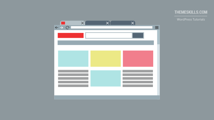
In this tutorial, I’ll teach you how to create columns in WordPress and add content to them.
I’ll show you how to do it using both Gutenberg and Classic editors. I know some of you are still using the old one.
So, let’s get right to it!
Add Columns in WordPress Using Gutenberg
If you’re using Gutenberg, then it’s going to be very easy!
Here’s what you need to do:
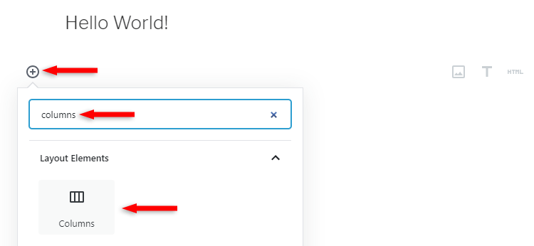
Step 1
Click on the + icon, search for “columns” and add the Columns block.
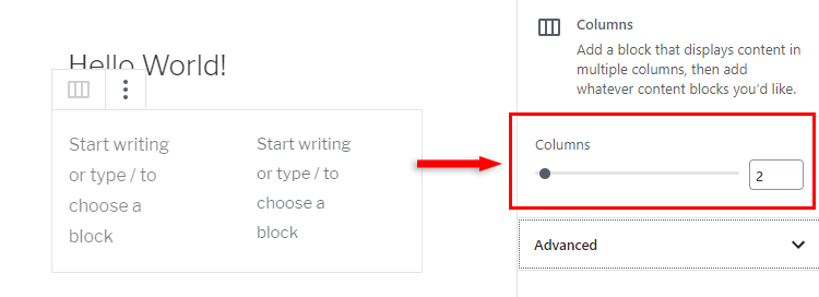
Step 2
By default, Gutenberg will add 2 columns, but you can add up to 6 from the right sidebar, while you have the block selected.
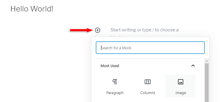
Final step
Add content inside the columns as you normally would.
Simply click on a column’s + icon and add whatever block you want: Image, Paragraph, Cover, and so on.
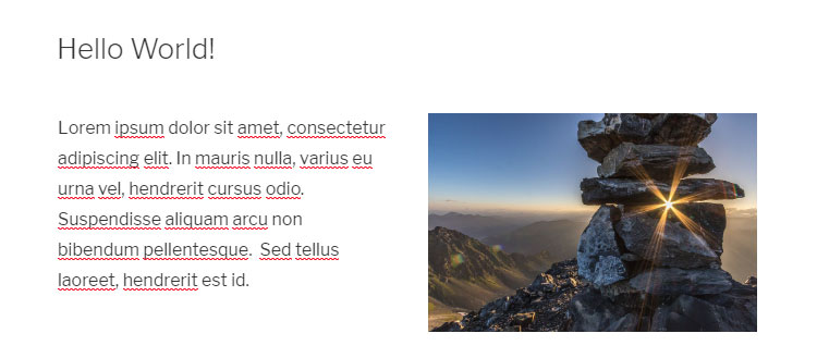
Here’s an example of content split into 2 columns:
A piece of cake, right?
Add Columns in WordPress Using the Classic Editor
If you’re using the Classic Editor, then you’ll need to install a plugin.
Of course, you can use some HTML and CSS, but it’s too much hassle, especially if you want to split content into columns often.
So, I won’t go into that. A plugin is the best way to go.
The plugin that I recommend is called Lightweight Grid Columns.
It’s developed by Tom Usborne, the creator of GeneratePress (affiliate link), which I use and like very much! I’ve also written a detailed review of the theme.
So, here’s what you need to do:
Step 1
Install and activate the Lightweight Grid Columns plugin.
Here’s how to install a plugin.
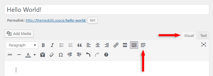
Step 2
Click on the grid icon found on the Visual editor.
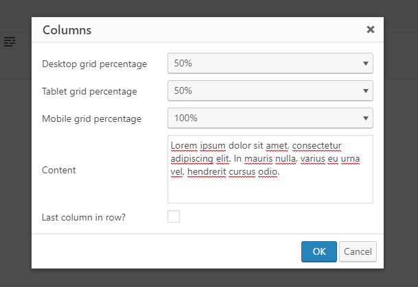
Final step
A pop-up will appear where you have to add the content (optional) and select the grid widths for desktop, tablet, and mobile.
Also, when you add the last column, check the box where it says Last column in row?
How it works + example
Normally, the Mobile grid percentage should be set at 100% all the time since the responsive design on smartphones is based on single columns, one beneath the other.
Why? Because smartphone screens are too small to display more than one column. If you display more than one column, the content will become hard to see and read.
The tablet and desktop grid percentages should usually be set the same, and here’s how it works.
Your row/container width is 100%.
Now, if you want to split it into two equal halves, what do you add? You add 2 columns at 50% each, right?
If you want to create 3 equal columns, then you add 3 columns at 33% each.
I know 33 x 3 = 99, not 100, but the code behind it will add something like 33.333… The numbers will be rounded up for you in the plugin’s drop-down.
You can also add columns with different widths in the same row.
For example, you can set the first and last column to be 1/4, and the one in the middle to be 1/2.
So, you’ll have to choose 25% for the first and last column, and 50% for the middle one.
Practical example
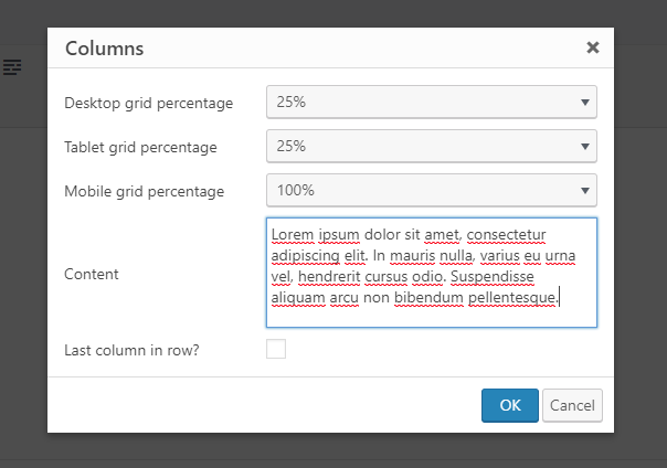
I’ll create 3 columns that are not equally split. The first and last one will be 1/4 (25%), and the middle one will be 1/2 (50%).
So, I’ll add the first one like this:
Desktop and tablet column grids set to 25%.
I’ll add the second one like this:
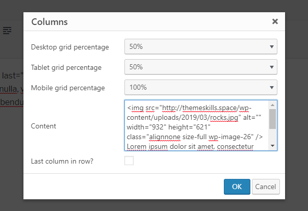
Desktop and tablet column grids set to 50%. I also added an image.
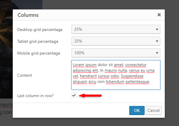
The third one will be set as the first one, at 25%, but I’ll also check the Last column in row? box. Always do that for the last column!
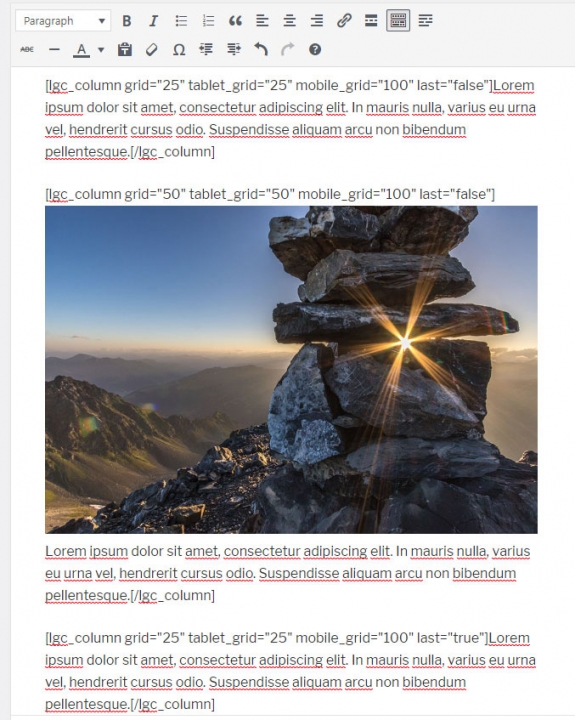
This is how it will look like in the Visual editor.
And this is how it will look like in the front-end:

An easier way to add content inside the columns
I added the content directly into the plugin’s Content box, but it can be a hassle if you want to add images, links, and so on. You’ll have to use HTML.
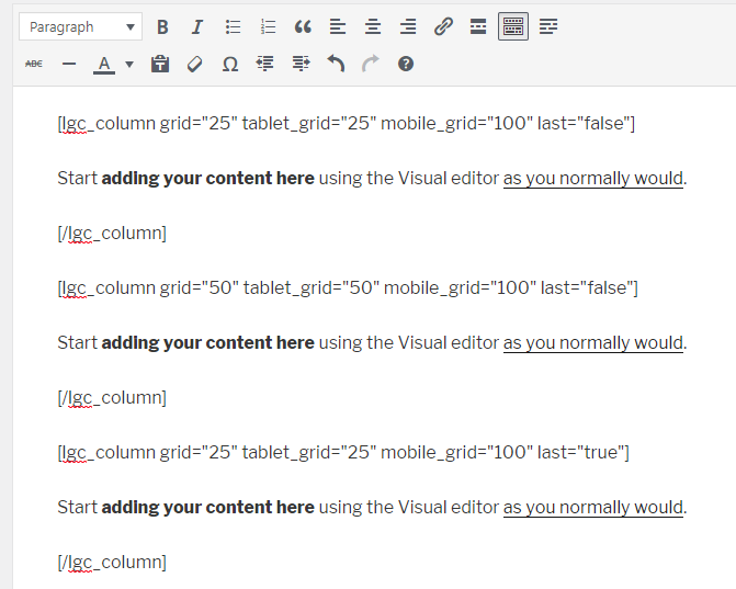
To avoid that, you can simply add the columns without adding content in the Content box.
Then, add content using the Visual editor inside the [lgc_column] [/lgc_column] shortcode.
A lot easier, right?
You can also add styles to the columns if you know some CSS.
You can do that by adding style="CSS code goes here" in [lgc_column].
[lgc_column style="background-color: #000;" grid="50" tablet_grid="50" mobile_grid="100" last="false"]...[/lgc_column]
That’s a Wrap
I hope you found this tutorial useful and comprehensive, and you managed to successfully add columns in WordPress!
If you have any questions or thoughts, drop a comment or send a message via contact or Facebook page.
You can also hit the follow button on Twitter and subscribe to the YouTube channel.
Don’t forget to share the post to help out others!

Leave A Comment